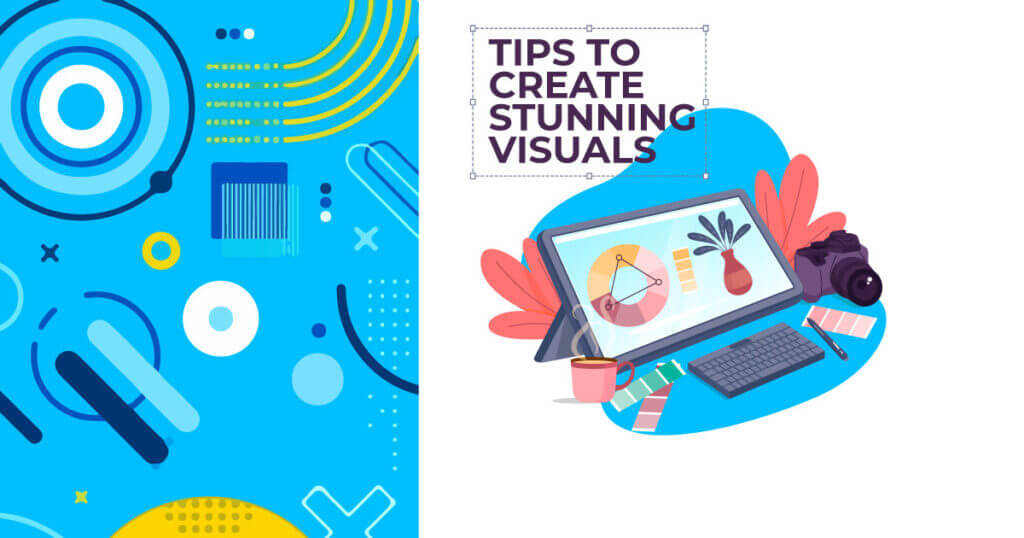
With the digital era taking the world by storm, we often hear terms like “aesthetic”, “visual content” and much more. If content is the key, I would say design is the keystone. As consumers we are surrounded by a gamut of data. Only when something intrigues us do we pause and look. What makes those designs special?
Pixel perfect creations are only a part of the experience. Design above all, is human centric. Its about building connections with people. Design thinking is for all and not just designers and arts. Here are some powerful graphic design tips to make your work stand out, no matter how experienced you are.
1) Less is more
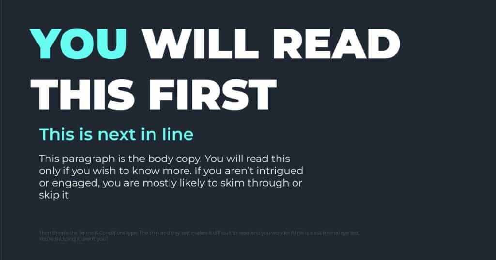
This is possibly the most quoted phrase of minimalistic design and there’s a reason it is. In a world filled with clutter, chaos and excess, simplicity is a sight for sore eyes. Therefore, minimal designs should speak of a clear understanding. A clean and crisp visual creates a lasting impression in our minds. On the other hand, an unorganized approach would as a result lead to an underwhelming output.
In conclusion, less is more when it does more.
2) Hierarchy
Hierarchy in design helps the viewer judge which content is more important over the other. A proper arrangement of this will help guide the reader along and create direction. A structure always makes it easier to navigate around and understand the information presented.
Hierarchy in design can be established through size, weight, colour, space, direction, depth and perceptive. If you wish to understand reading patterns in depth , click here
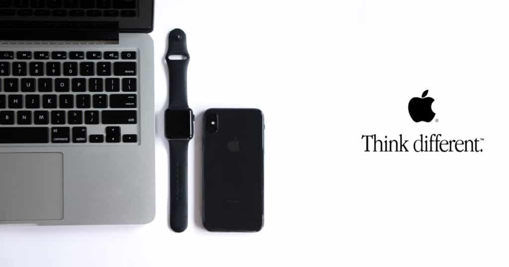
3) Negatives are positive
Take a look at the image below
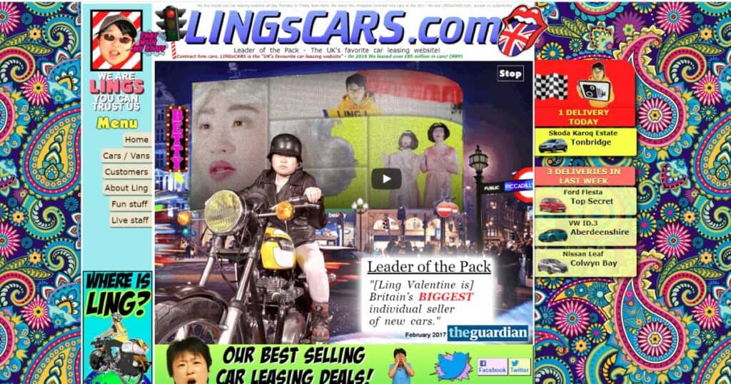
The sight of flashing graphics, the array of colours, typography, images. You don’t know which element is important (wish they’d paid attention to Hierarchy) and the clutter certainly hurts the eye. In short, its too much to take in.
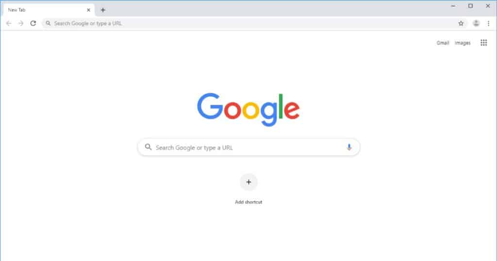
Google is the perfect example of negative space used effectively. No unnecessary use of colour, no advertisements, just a neat interface. There is enough room for the logo to breathe and you feel a sense of calm looking at the site.
Negative space refers to the area which surrounds an object that gives a cushion to text, images or any visual element. It is often synonymous with “white space.” White space and negative space are essentially the same, the former used in print media and the latter in the digital space.
4) You’re my type
Typography goes a long way in making stunning designs. Fonts are like people, they have a unique set of qualities that form their personality.
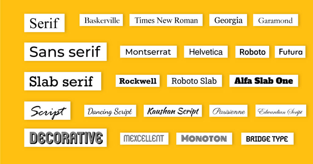
Types
- Serif: One of the oldest font types, Serif has a classical and traditional tone. Popularly used in print media, serif fonts provide a sense of trust and respectability The word ‘serif’ itself means the ‘stems’ or ‘feet’ that project out the tops and bottoms of each letter. Brands which use this elegant style in their logos include the likes of Zara, Vogue and Tiffany & Co.
- Sans Serif: Sans means without. These types of fonts offer a clean, modern look. Its straight lines with no extensions emphasize clarity and simplicity. This style is very popular in the digital arena and looks best when paired with its serif counterparts. For example, popular san serif logos include Google, LinkedIn, Microsoft.
- Slab Serif: As designers and typesetters began to experiment with Serif fonts, they gradually develop strong variants which were bolder, solid and block like. This new typeface was called “Slab Serif” and communicated importance and confidence. Slab serifs are seen in logos like Honda, Sony and Volvo.
- Script: If you’re looking for a cursive style, Script fonts are your go-to. Formal scripts are characterized by flourishes and swashes, often reserved for headlines and shorter phrases. Likewise, they bring a touch of femininity and sophistication. Informal scripts provide flair and are perfect for a causal style. Coca-Cola’s iconic curvy typography uses this font style.
- Decorative: The rebels of the font families. Unconventional, unique and appealing, Decorative fonts are popularly used for display texts. Their creativity personality makes them fun to work with. For instance, brands like Disney, Harry Potter, Cadbury use decorative fonts to echo their originality.
Find a font that complements your brand or design to convey your message effectively.
5) Space, the final ‘fontier’
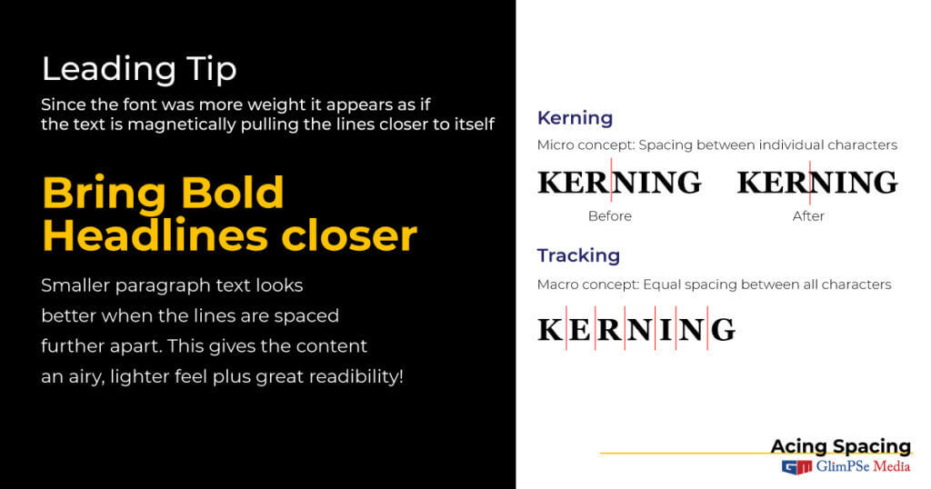
Spacing within blocks of text and elements is equally important. This introduces us to the concept of Leading, Kerning and Tracking. Let’s take a closer look at these terms
- Leading refers to how text is spaced vertically. In addition to fluidity, line spacing improves legible. You should keep this in mind while writing paragraphs or content blocks. In other words, lines too closer or too far would disturb the overall composition
- Kerning is the vertical space between letters. This can be a powerful tool to influence aesthetic and communication through type despite its subtlety
- Tracking: While kerning involves the spacing between two characters, tracking involves equal spacing throughout the entire word. In order to make words look airy, important or fill space, this tool is very handy.
I hope that this article helped you to understand design a little better. Design is all about practice, research and experimenting. We’re all learners here! Moreover, look at websites like Pinterest, Dribble or look at your favourite brands for inspiration. Let us know in the comments how these simple tips helped you enhance your artwork. Will be back with more tips and tricks to make your design journey fun. Meanwhile, happy Designing!
To stay updated, check out the Blog Section of our page